 The coronary angiogram is often referred to as a road map of the heart. As such, it serves the cardiologist and cardiac surgeon well. It shows where the coronary arteries are, how they intersect, the angles of the branches, etc. There are diagrams of these anatomical features in many textbooks, but the reality is that these characteristics can vary from individual to individual, so it’s necessary to get a road map for each individual in whom an intervention is being contemplated. Then, of course, there’s the issue of narrowings in the coronary arteries. Should these receive stents? Should they be bypassed? Should they be left alone and treated with medical therapy?
What has become clearer in the past few years is that seeing is not believing. The angiogram may show a narrowing, but that narrowing may not be causing a reduced flow of blood to the heart, a.k.a. “ischemia.” Stenting or bypassing such a “non-ischemic” narrowing may not be of much benefit to the patient, but it will add a small risk factor of stent restenosis or perhaps a surgical complication. This was the conclusion of the FAME trial, in which the use of physiologic measurement, in the form of a pressure wire to measure blood flow across a narrowing, resulted in one-third less stents being used, and interestingly, one-third less MACE (Major Adverse Cardiac Events).
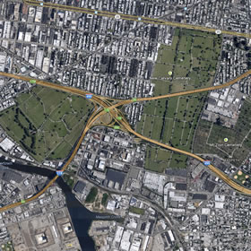
 So, to bring the analogy home, think of using Google Maps to see how to get from where you are to where you want to be. If, for example, you were driving into Brooklyn, you might want to call up a road map. And this is what you’d see.
Okay. I can see the Long Island Expressway intersecting the Brooklyn-Queens Expressway. “X” marks the spot, My road map shows me the way to go. The main traffic arteries tell me that I should just cruise along the LIE and merge onto the Brooklyn-Queens Expressway.
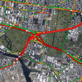
 But what if you clicked the option to add “traffic” to the road map? Well, here’s what you’d see. The main wide traffic arteries that looked like the right way to go in the first road map are now being shown as red, blocked up, bumper-to-bumper. In coronary terms, “ischemic.” You’d be much better taking the side roads or the northern route. Physiologic monitoring, like FFR or iFR, is like having a road map “with traffic.”
The point is that the coronary angiogram only shows part of the picture. It shows the lay of the land. But physiologic measurement, using FFR (Fractional Flow Reserve) or iFR (Instant wave-Free Ratio) shows how well traffic is moving. And when you’re deciding whether or not to stent or bypass an artery, or perhaps to just leave it alone and treat it with medications, you need to know how well the traffic is moving.
For more information on these modalities, visit our Intravascular Guidance Center.
And for even further information, check out this album from the San Francisco Bay Area punk pop band, “This Time Next Year,” titled “Road Maps and Heart Attacks.”


Interesting review of how IC’s use intravascular diagnostics to better treat patients. However, iFR is not a compatible indices to FFR. If interested I invite you to look up the results of the Resolve study as it confirms iFR is accurate only 80% of the time, while FFR is 100% accurate. If your loved one is being treated, which modality would you want their cardiologist to use?
It is important to say that the RESOLVE study was the responsable to determine the hybrid strategy used today. Considering that the accuracy in the edge results of iFR is more than 90%, we can abolish 48% to 65% the adenosine infusion. The ADVISE IN PRACTICE corroborates this analyse afirming that the iFR and FFR agree 94% when the hybrid strategy is used.
There are studies ongoing, Define-Flair, iFR SwedeHeart Regitry and Sintax II that will drive us in the best strategy.